Elizabeth & Virginia
FOOD BRAND
PRODUCT ADVERTISING
A duo of adverts for Fortnum & Mason which educate, entertain and advertise products to the customer, cementing the history and DNA of the brand through the stories and favourite foods of two of its most famous fans: Elizabeth Taylor and Virginia Woolf.
Both shoots have been produced in a consciously atmospheric style, with mood and detail representing the underlying tensions in each relationship and context. There is a violet thread running through both scenes - Virginia's ink and Elizabeth's eyes. Where the Woolf piece resembles a still life painting, the Taylor piece resembles a film set.
#LongLoveFortnums
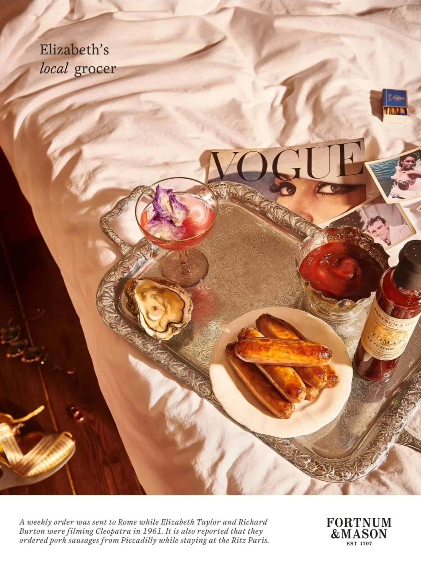

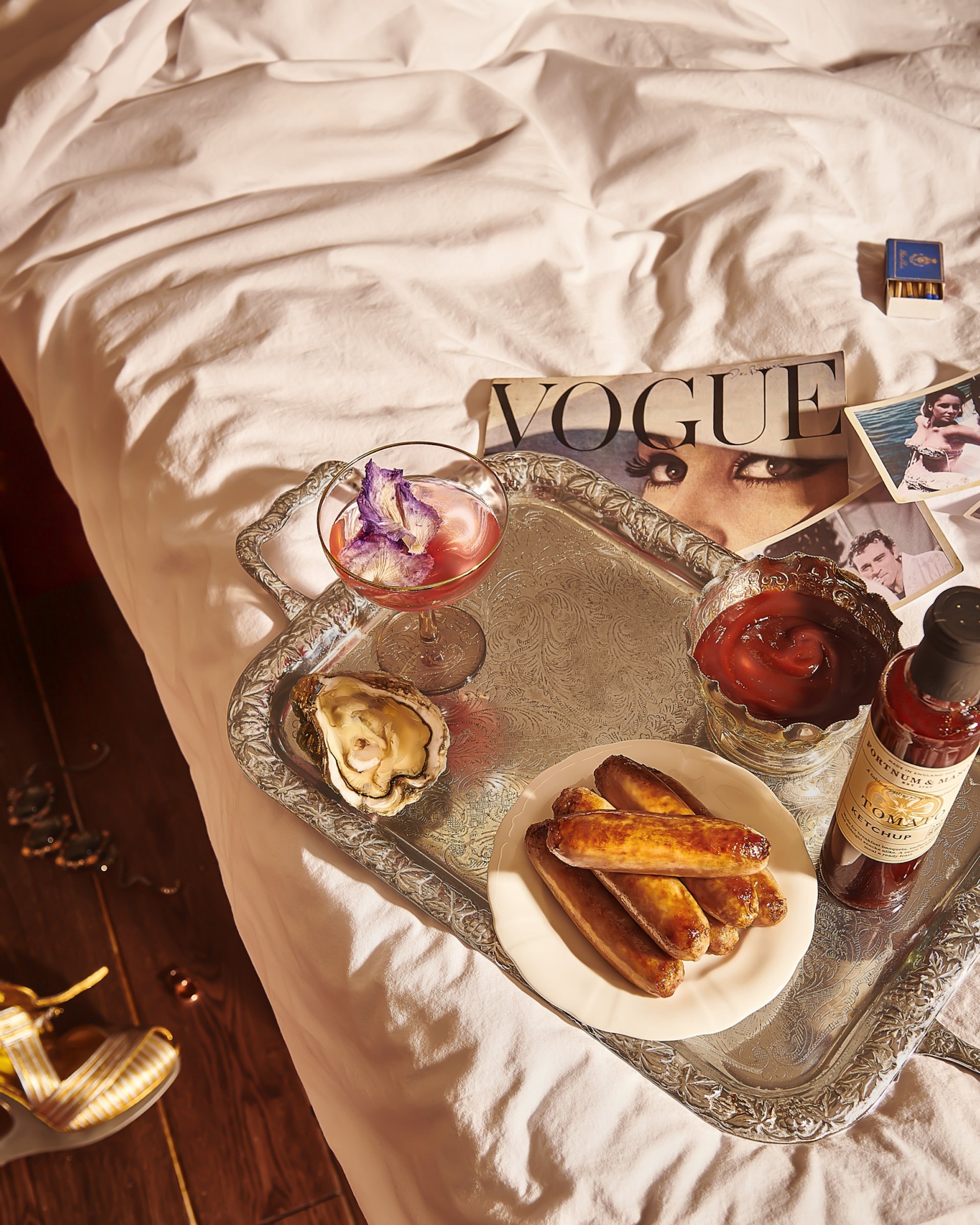
ELIZABETH'S LOCAL GROCER
Strategy / Approach
Elizabeth Taylor and Richard Burton are recorded as being famous fans of Fortnum & Mason. Our scene imagines their suite at the Ritz Paris, where they reportedly had pork sausages flown in from London [Furious Love: Elizabeth Taylor And Richard Burton And The Marriage Of The Century, Sam Kashner and Nancy Schoenberger]. It is also reported that "…a weekly order (quite probably crammed with aphrodisiacs) was sent to Rome while Richard Burton and Elizabeth Taylor were filming Cleopatra in 1961." [fortnumandmason.com]
Execution
The setting represents a room service order on the bed in their hotel room at the Ritz. Fortnum's pork sausages and tomato ketchup are humorously paired with an elegant violet-adorned cocktail and the ultimate aphrodisiac - the oyster. Wedding rings, jewellery and a pair of YSL wedges are discarded on the floor, representing salient parts of Taylor's life. A vintage copy of British Vogue sits next to a box of Ritz Paris matches and a collection of photographs, depicting the couple as the world's first celebrity couple - who inspired the word paparazzi.
As they embraced a glamorous, sensual and devil-may-care lifestyle, so does this advertising piece, highlighting the opulence of high-quality food, drink and culture.
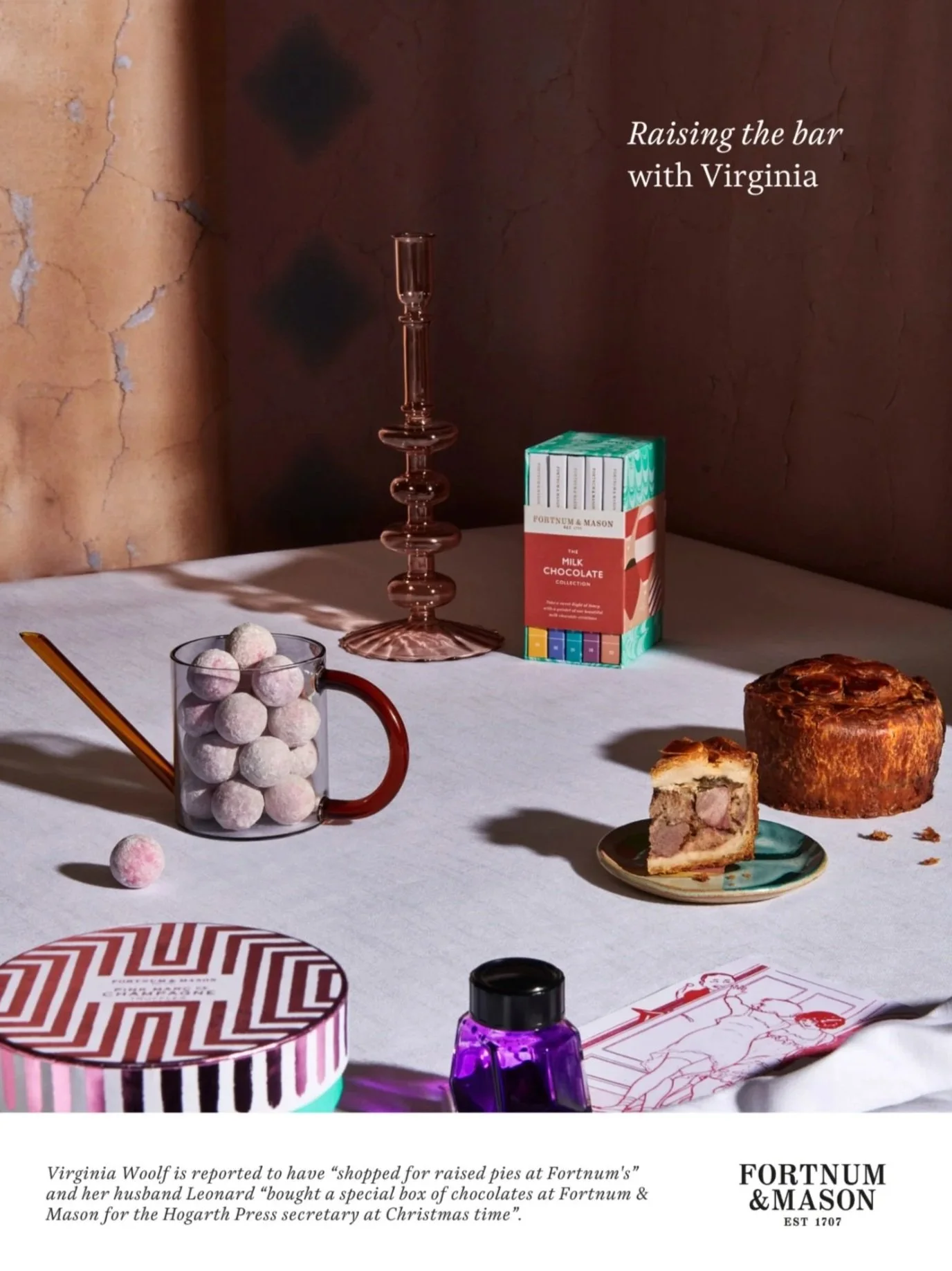

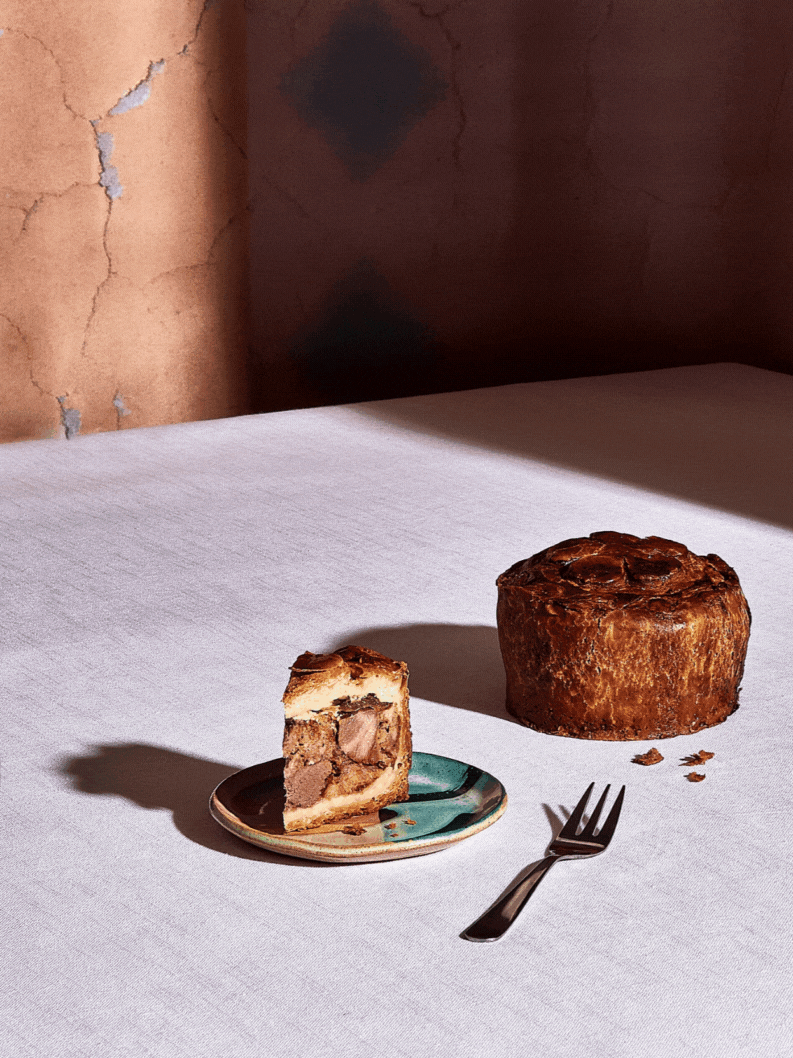
RAISING THE BAR WITH VIRGINIA
Strategy / Approach
Virginia and Leonard Woolf were known fans of Fortnum & Mason. Our scene imagines them at the dining table of Virginia's sister Vanessa's home and studio, Charleston - gathering point for the Bloomsbury Group, who, as Dorothy Parker noted, 'lived in squares, painted in circles and loved in triangles.'
Execution
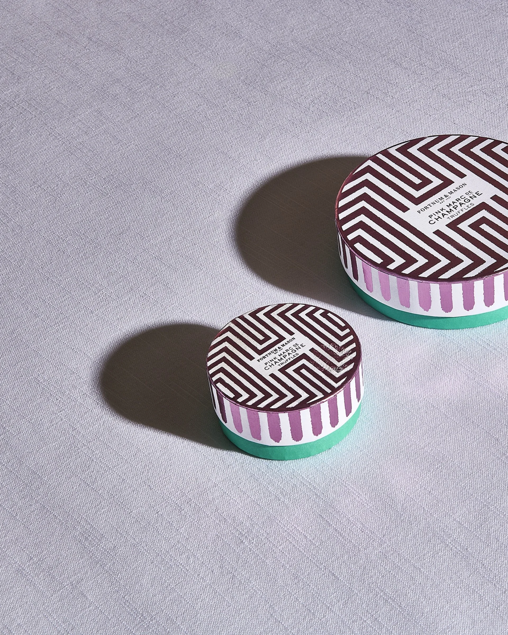
The abstract backdrop references Charleston's painted dining room, and features squares. The scene includes Fortnum's circular Marc de Champagne truffles, a rectangular library of chocolate bars, and a hand-raised round Venison & Red Onion Pie. A triangular slice sits on a glazed ceramic stoneware saucer created for modern-day Charleston. We see flashes of Fortnum's Eau de Nil, painterly brushstrokes on packaging, and a part-used bottle of Woolf's favourite ink - Waterman Tender Purple.
The scene is at once considered and messy; a glimpse of the unconventional. As they dared to flout convention, so does this advertising piece - deliberately ignoring staging and set design conventions, and raising the bar in choosing the highest quality of life.
The pie is so perfect it almost looks edited in. This is a real shoot with no artifice - and all food items were consumed responsibly afterwards!
FEEDBACK
"Stunning ❤️. You should be proud of it. I just love it. Vintage Vogue heaven! 😍" @cloverfoodandevents
"These are truly stun-NING!" Felicity Avenell, Press and Marketing Officer, Charleston Trust
"This is beautiful 🖤" @luke_makesphotos
"I love a good brief, but yours is on another level. It makes my life so much easier when we shoot." Mark Wildsmith, Photographer
CREDITS
Production, Art Direction, Content Creation, Copywriting, Design, Prop Making + Styling, Set Build + Design: Lauri King
Food Styling, Photography + Editing: Mark Wildsmith,
Assistant: Amy
©2024 Lauri King + Mark Wildsmith. All rights reserved.